Uniquely
Arizona
An energetic brand expansion bringing personality, clarity, and humor to an existing creative direction.
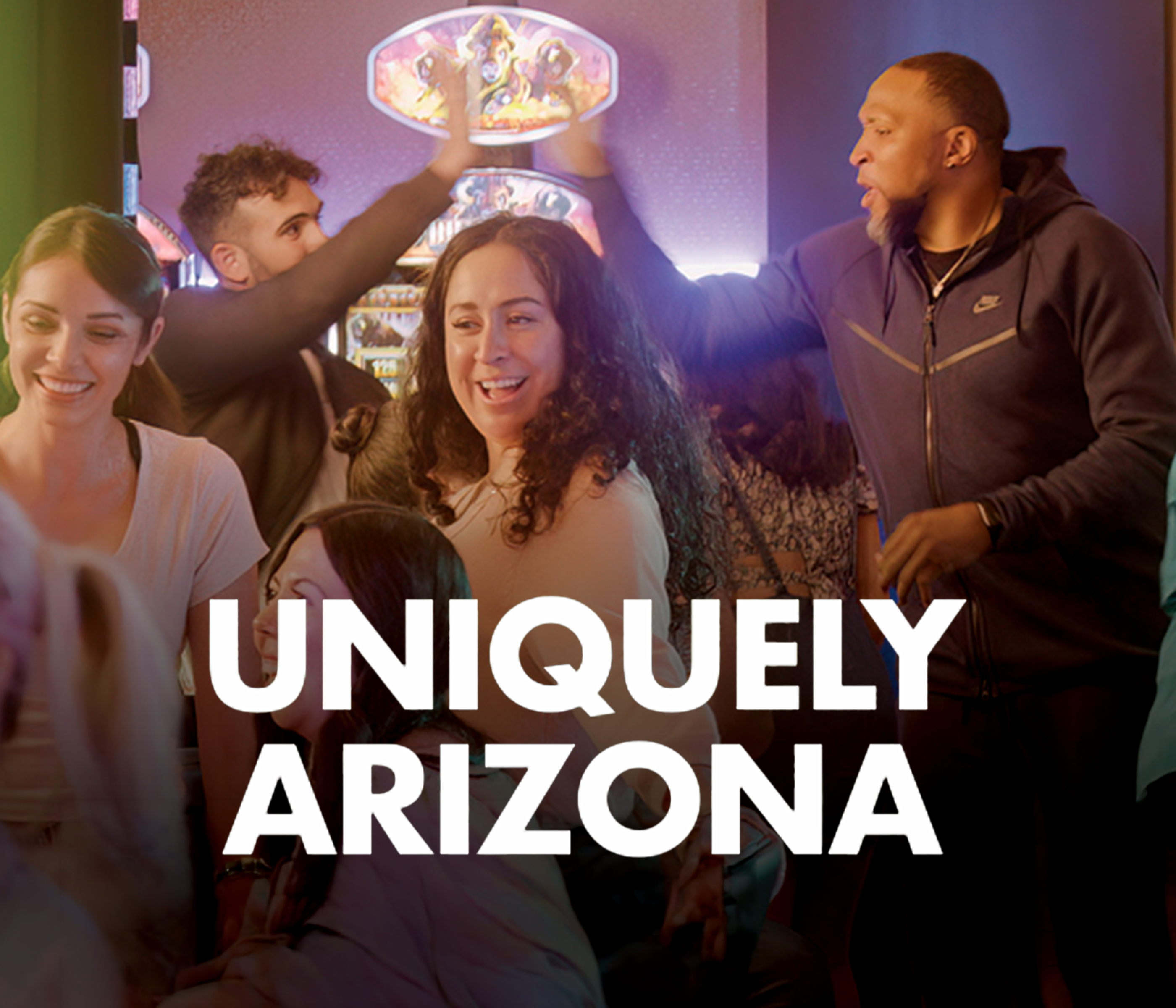
A little messy, a lot charming, real people, inside jokes, and a tone only this property could own
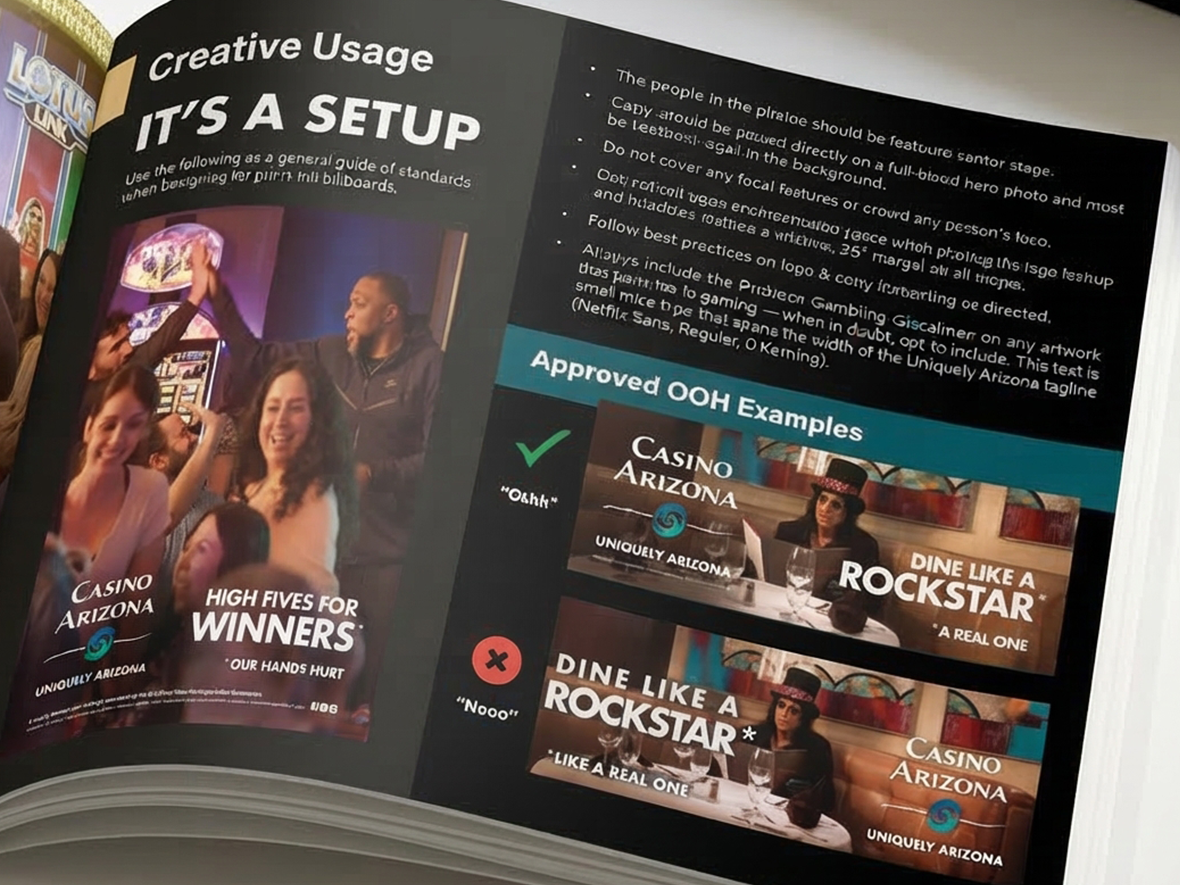
A regional TV idea built out into a full campaign system across print, signage, screens, and promotions, balancing candid photography with clever copy and scalable templates.
Typography
Futura Bold, all caps, paired with the Casino Arizona lockup.
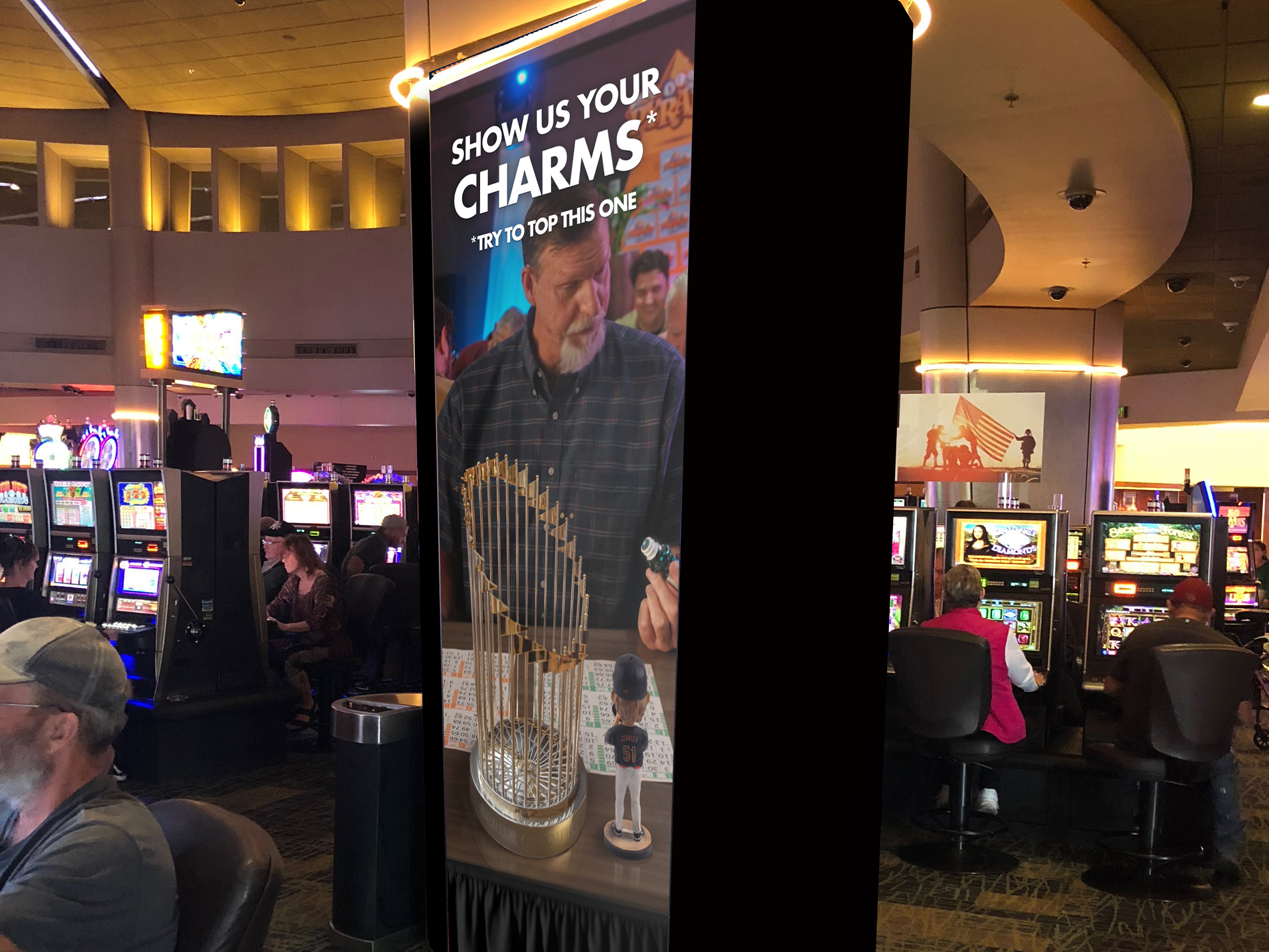
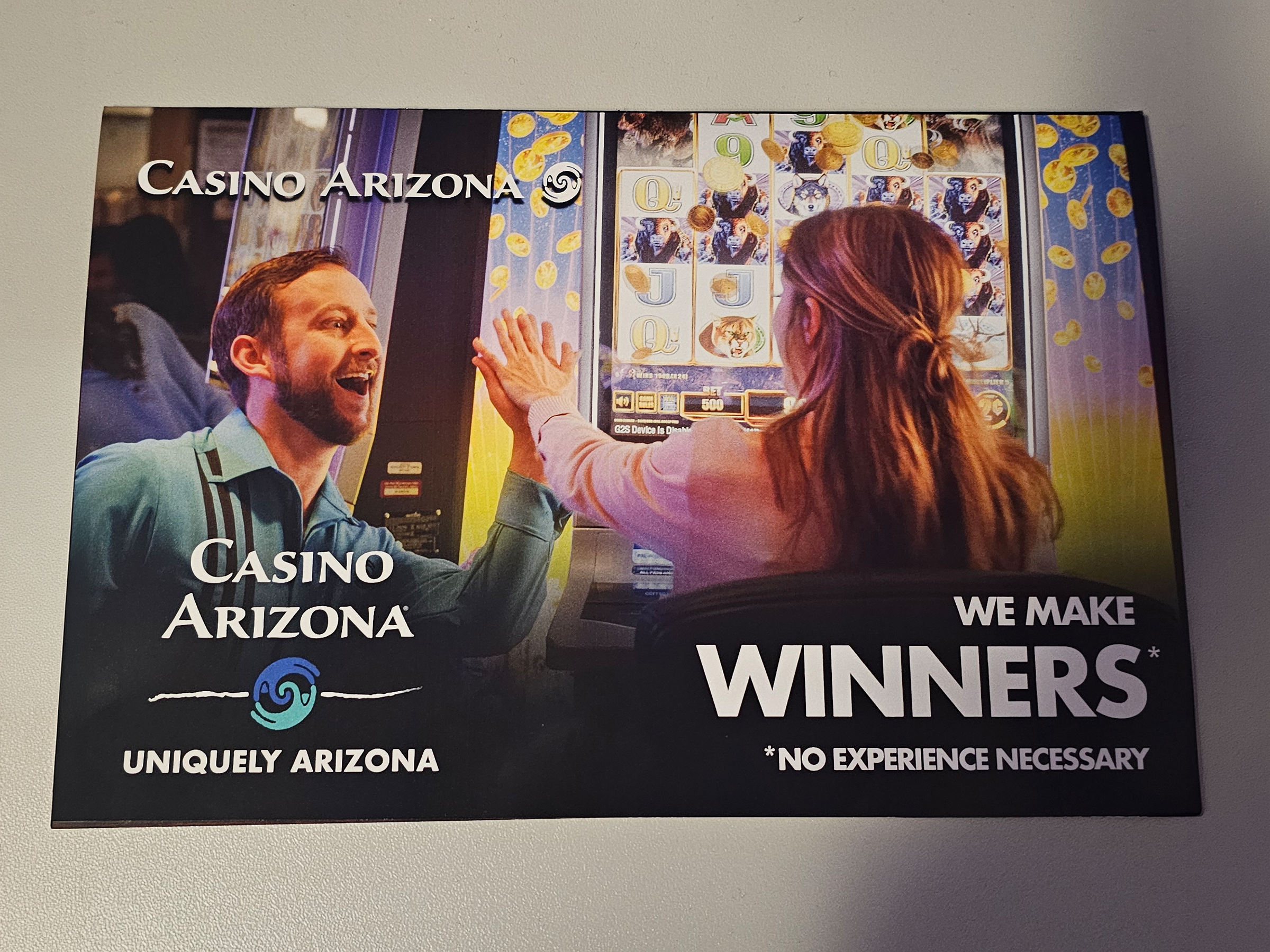
Photography
Motion blur, expressive faces, and honest lighting, never over-edited.
Voice
Punchy, playful copy full of character.
Layout
Strong headline contrast and strategic asymmetry.
The Opportunity
The brand had voice, but no structure. A regional TV campaign had set the tone, and creative now needed to expand into everything the property touched, at scale, with the edge intact.
- Turn a TV voice into a portable campaign system
- Codify typography, color, and photo direction
- Build templates usable across departments
- Preserve the humor at scale
The Strategy
The work leaned into humor, grit, and self-awareness: candid photography, strong headline contrast, and strategic asymmetry that keeps even a pillar wrap feeling like it has a personality.
- Lock an all-caps Futura Bold wordmark and lockup
- Build candid photo direction with honest lighting
- Codify punchy, playful copywriting
- Ship templates and OOH for department use
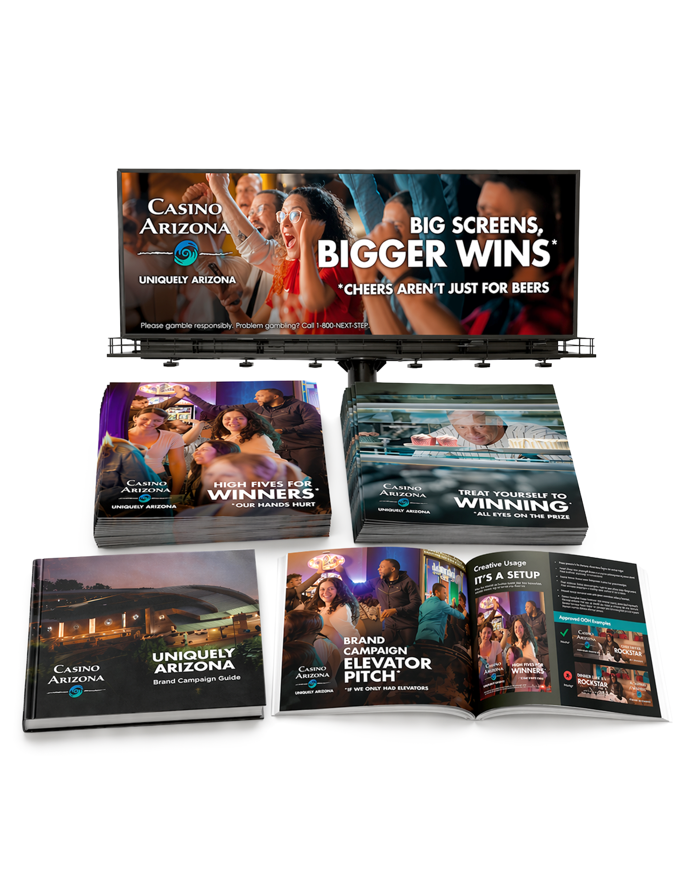
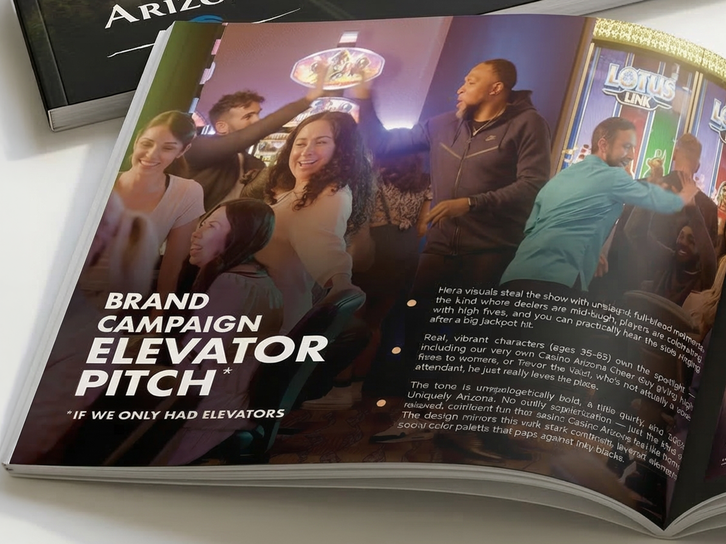
Selected Applications
The Impact
Brought a regional TV voice to life across every property touchpoint.
Gave internal teams templates that extended the campaign without flattening it.
Stood out in a saturated local casino marketing landscape.